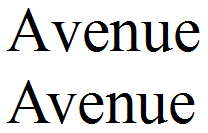
Kerning adjustments are small differences in the shape between glyphs, necessitated by the ways that letter shapes interact with one another. Below is an example from the Latin script. The top line has no kerning, but the second line does. Here the effect of the kern has been to reduce the space between the ‘A’ and the ‘v’. ‘A’ has a top-down slant on its right side, and ‘v’ has a top-down slant on the left side. If these glyphs are placed together, they look too far apart. A kerning adjustment makes the spacing more appropriate.

Kerning is done for aesthetic reasons, but it also has importance for the legibility of text. You might have noticed that in the above example, the unkerned line looks a bit more like “A venue” than “Avenue”. For an experienced reader that is not difficult, but for a new reader, it is an unnecessary stumbling block.
Kerning is an extra step for a typeface/font designer. Many carelessly-produced fonts do not have kerning. But for the major fonts, put out by reputable type foundaries, kerning the Latin script glyphs is quite common.
Arabic script is well known as a cursive script. When two glyphs join, there is no reason to kern. But there are non-connecting letters as well. A word may consist of all non-connecting letters (e.g. درد; Pers. ‘pain’), all connecting letters (e.g. گل; Pers. ‘clay’), or a combination (e.g. برنخ; Pers. ‘rice, bronze’). As one would imagine, the space between two letters that do not connect should be smaller than the space between words. Because of the shapes of Arabic glyphs, and the way computers make guesses about the width of glyphs, this goal is often imperfectly realized.
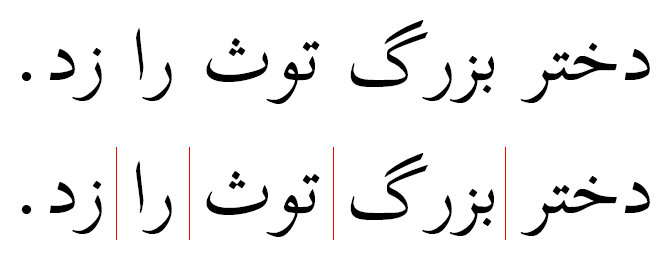
Here is an example sentence from Persian, meaning “The big girl hit the ball.” as rendered by the Scheherezade font, which has no kerning. The top line is the plain rendered text; on the second line I have indicated the word boundaries.

This is far from an extreme example, but the difficulty that presents itself to the reader should be evident. In the second word the space between ‘ر’ and ‘گ’ is nearly as large as the space between any of the words. Less dramatically, but importantly for legibility, the distance between the non-connecting letters of the last three words could also be reduced, emphasizing the unity of the glyphs within the word, and visually enhancing the word boundaries.
Some people assume that having difficulty in identifying word boundaries is a challenge inherent to the Arabic script. In reality, it is just a matter of font design that is not as careful as one might wish it to be. In a handwritten Arabic text, such as this one, the calligrapher naturally writes the words appropriately.
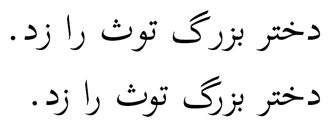
Here is a comparison of the same sentence, without kerning and with kerning (top and bottom, respectively). Even for someone who doesn't read Persian, it should be reasonably clear that the word boundaries are easier to see in the kerned sentence.
